One of my kind coworkers responded to my plea for help. Apparently the layout I'm trying to do is one of the biggest, or most common, problems with CSS layout. That is, a three column layout with fixed width sides and a fluid center. It's amazing to me that it can be that difficult, but it is. It's referred to as "The Holy Grail."
My nice coworker pointed me to a recent article on alistapart.com. I was so excited, I went home and spent Monday evening implementing my layout using this technique. Well, kind of. It turns out that it doesn't work in Internet Explorer. I should've spent more time playing with the examples and I could've seen this, but I didn't.
Given the percentage of people that run Internet Explorer, I can't use a layout like this. In IE 6 when you resize the window the sidebars flicker and disappear and move around. Even if I could, it didn't seem a good idea to use a bunch of hacks to get around us. They probably break in IE 7 anyway.
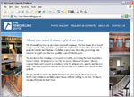
So I decided to bite the bullet angle is a hybrid layout, as described in Designing with Web Standards. So Tuesday night that's what I did. (Yes, I did spend Valentine's Day night redesigning a construction web site.) It seems to be working quite well actually. You can check it out here (note this link is going to break when I launch the site, but I'll try to update it then). Note that only the home page is done so far.




 Another lovely development on the abortion front from earlier this week.
 It looks like the South Dakota legislature is about to pass a ban on all abortions except when the life of the mother is at risk. They are specifically aiming to have this loss taken to the Supreme Court in the hopes of getting Roe v. Wade overturned. Here are a few disturbing snippets from the article:
 My friend Leanne is pregnant! It's very exciting. She married a sweet guy named Charles last year and now they have a bun in the oven. She's still experiencing first trimester yuckiness, but this ultrasound made it official. The baby is doing great so far.
Having so many new babies and pregnancies around lately certainly makes me think about having kids. But once the gut reaction passes, I remember that I'm still not quite ready for that myself. I just snuggle my puppy and know that is good enough for now. Maple is pretty damn cute and incredibly soft, you know. Babies can come later. :-)

